Traditional tattoos stay clear when open skin has a job to do. Negative space, meaning the untouched skin around and inside the design, gives bold images a break from one another. From across the room, that breathing room can make the difference between a tattoo that reads instantly and one that turns into a dark blur.
At Lucky DeVille Tattoo Co., we plan the skin breaks with the same care we give outlines, color, and shading. Traditional tattoos are known for bold lines and recognizable symbols, but their lasting strength often comes from what we choose not to ink.
Let Open Skin Make Your Tattoo Read Clearly
Traditional tattoos are meant to be understood quickly. A rose should look like a rose, a panther should look like a panther, and a banner should be easy to read without someone needing to stand inches away. Open skin creates clear visual breaks, so each part of the tattoo has room to speak.
Heavy black outlines, limited color palettes, and simple symbols all support that classic look. Still, even the strongest outline can lose its impact if every inch of skin is filled with ink. We use negative space to keep the eye moving naturally through the design instead of getting stuck in one crowded area.
Open areas may appear between major shapes, inside an object, or along an outer edge. They help us separate forms while keeping the overall tattoo bold.
Traditional Tattoos Depend on Intentional Space
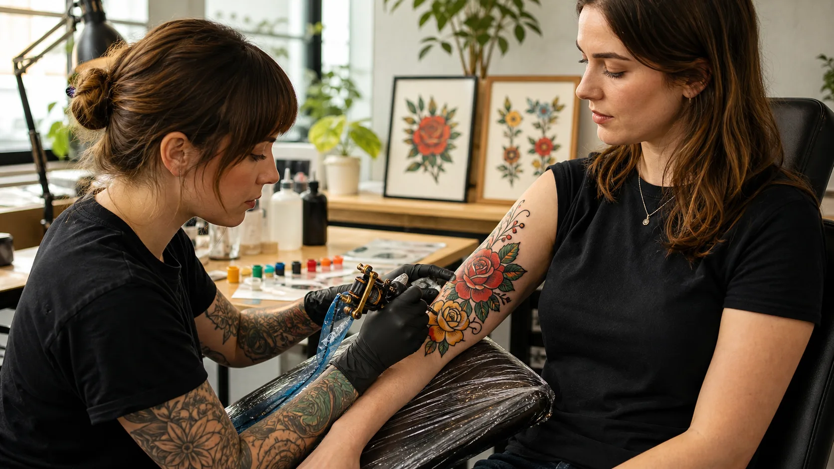
Classic traditional tattoos often feature strong, familiar imagery: eagles, ships, daggers, roses, snakes, swallows, panthers, and pinup figures. These subjects can carry plenty of color and black shading, but they still need separation. Without it, wings can blend into bodies, petals can merge into leaves, and lettering can disappear into nearby shapes.
Intentional open skin is not the same as an unfinished gap. Every skin break should help define the image or direct your eye through the composition. Depending on the design, we may use open skin to create:
- A highlight along a snake’s curve
- Separation between a swallow’s wing and body
- Light-catching areas on flower petals
- Clear space around lettering or a banner
- A clean edge between a dagger blade and surrounding imagery
A tattoo does not have to look sparse to use negative space well. Traditional tattoos can feel saturated, dramatic, and full of personality when black, color, and natural skin tone are balanced. The goal is simple: give every part of the artwork enough contrast to remain easy to follow.
Contrast and Spacing Protect Classic Details
Contrast is one of the main reasons traditional tattoos remain readable. Dark outlines against open skin build the structure first. Solid color fields and black shading then add weight, depth, and attitude without taking over the whole design.
This matters even more with small and medium traditional tattoos. Fine details that look sharp in a reference image may not have enough room on the body to stay separate. When elements sit too close together, they can read as one heavy shape instead of several clear images.
Spacing also matters between pieces of the design. A banner needs room away from a rose. A dagger blade needs a clean border. Letters need visible gaps between them. We look at the tattoo as a whole, not just as a collection of small details, so each part has room to remain recognizable.
Skin-tone highlights are another useful part of traditional tattoo design. Rather than relying on lots of tiny marks or large areas of white ink, open skin can suggest shine, light, and motion. It may create a glint in an eye, light on a wave, chrome-like shine, or dimension in a petal.
Negative Space Helps Traditional Tattoos Age Gracefully
A clear design starts with room for the tattoo to settle over time. As ink naturally softens beneath the skin, very tight gaps and packed details may appear closer together. Traditional tattoos are often built with bold lines and simple shapes, which gives them a strong visual structure from the start.
That does not mean every traditional tattoo needs to be large or simple. It means the amount of detail should match the available space. When we design a piece, we consider how line weight, shading, color, and open skin will work together over the long term.
A few choices can help protect the main image:
- Use bold outlines that support the subject’s shape
- Keep small details from competing with one another
- Leave visible skin breaks between nearby elements
- Match the design’s detail level to its placement and size
- Use color and black shading with a clear purpose
Placement, skin quality, aftercare, and the artist’s technique also affect how a tattoo looks as time passes. We can help you think through proportion, spacing, and detail level before ink goes on skin, especially when you want a classic design that will continue to read clearly.
Placement Shapes the Space Around Your Tattoo
The body changes how negative space works. A forearm, calf, upper arm, or thigh can give a design more room for balanced shapes and open borders. Smaller areas, such as fingers, wrists, ankles, or behind the ear, may call for simpler forms and fewer tight details.
Natural curves matter, too. A design that looks balanced on paper may need adjusted proportions to fit an arm, leg, or shoulder comfortably. We consider how the tattoo will look from different angles, where the body bends, and how the image can stay clear as you move.
Planning is especially important when you already have tattoos nearby. In a sleeve, patchwork collection, or larger back piece, open skin can separate individual designs without making them feel disconnected. Strategic gaps keep the full area from becoming too dense while allowing each tattoo to keep its own identity.
Reference images are helpful, but they are a starting point rather than a blueprint. A custom traditional tattoo may need a wider border, a simplified feature, or more open skin than a photo suggests. Those adjustments are part of making the design work on your body.
Plan for Bold Art That Can Breathe
For custom traditional tattoos at our Amherst studio, we focus on the relationship between the inked areas and the untouched skin. Whether you are considering a rose, a classic animal design, lettering, a cover-up, or a larger custom piece, clear spacing gives the artwork a stronger foundation.
Late autumn can also be a practical time to plan new tattoo ideas, since covered healing may feel easier in cooler weather. Fresh tattoos still need thoughtful aftercare, including protection from tight clothing, rubbing, and busy holiday activities that could irritate the area.
The best traditional tattoos do not need to fill every open spot to make an impact. When bold outlines, color, black shading, and skin tone each have room to work, the result can stay readable, balanced, and unmistakably yours.
Find the Right Artist for Your Design
At Lucky Deville Tattoo Co, our artists can help shape a design that feels intentional from the first sketch. Browse our traditional tattoos artists to find a style that fits your idea. We will work with you to create a piece built for clarity, character, and lasting visual impact.