Make Every Word Easy to Read
A lettering tattoo can carry a name, a promise, a lyric, or a reminder you want close for life. Yet the meaning only comes through when every letter is clear enough to read at a natural distance. Spacing is one of the biggest choices behind a tattoo that feels balanced on day one and stays understandable over time.
At Lucky DeVille Tattoo Co., we create custom tattoo lettering for clients in Amherst, Buffalo, and throughout Western New York. Before ink meets skin, we consider the message, font, size, placement, and the room each letter needs. Good spacing helps a design hold up through everyday movement, natural skin changes, and the softening that can happen as a tattoo ages.
Tattoo Lettering Needs Room to Breathe
Words need negative space, which is the open area around and between letters. Without it, lettering can look cramped, especially once it is tattooed on skin instead of viewed on a bright phone screen. A tight design may seem clean in a small digital mockup, but inked letters need enough separation to remain distinct.
We look at two types of spacing when designing tattoo lettering:
- Kerning, the space between individual letter pairs
- Tracking, the overall spacing across a full word
- Word spacing, which separates one idea from the next
- Line spacing, which keeps stacked text from blending together
Kerning matters because not every letter pair needs the same amount of room. An “A” beside a “V” may sit comfortably closer together, while other combinations can need more space to avoid visual confusion. Tracking helps the whole word feel even, rather than packed at one end and loose at the other.
Names, dates, memorial pieces, song lyrics, and meaningful phrases all deserve this attention. These tattoos are often meant to be read again and again, not guessed at. When the spacing feels intentional, the message gets the attention it deserves instead of getting lost in crowded letterforms.
Letter Shapes Need Clear Space
Some letters create more spacing challenges than others. For example, “RN” can sometimes read like an “M” when the letters sit too close. “CL” may look like a “D,” and “VV” can appear to be a “W.” Curves, sharp serifs, decorative tails, and overlapping flourishes can also change how a word reads.
Font choice has a lot to do with this. Script and cursive styles may connect naturally, but their loops can become hard to separate in a smaller tattoo. Old English fonts often have bold details and tight interior spaces. Typewriter lettering can look simple, yet its tiny serifs still need room. Fine-line fonts can be beautiful, but they require a realistic size and layout.
A design that works well across a larger area may not translate directly to a wrist, finger, ankle, or collarbone. Reducing the size without adjusting the letter shapes can turn clean lettering into a blur of thin lines.
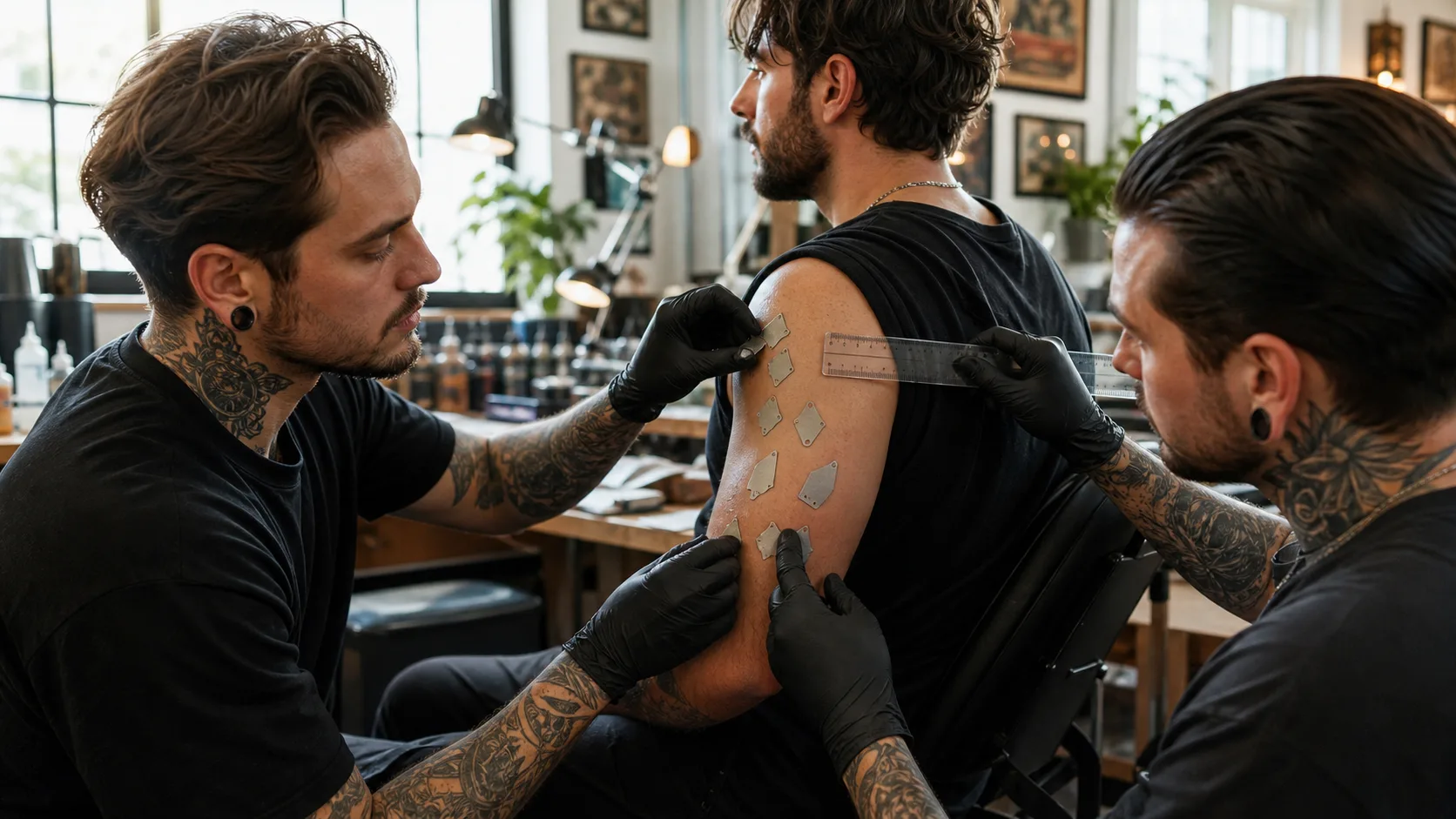
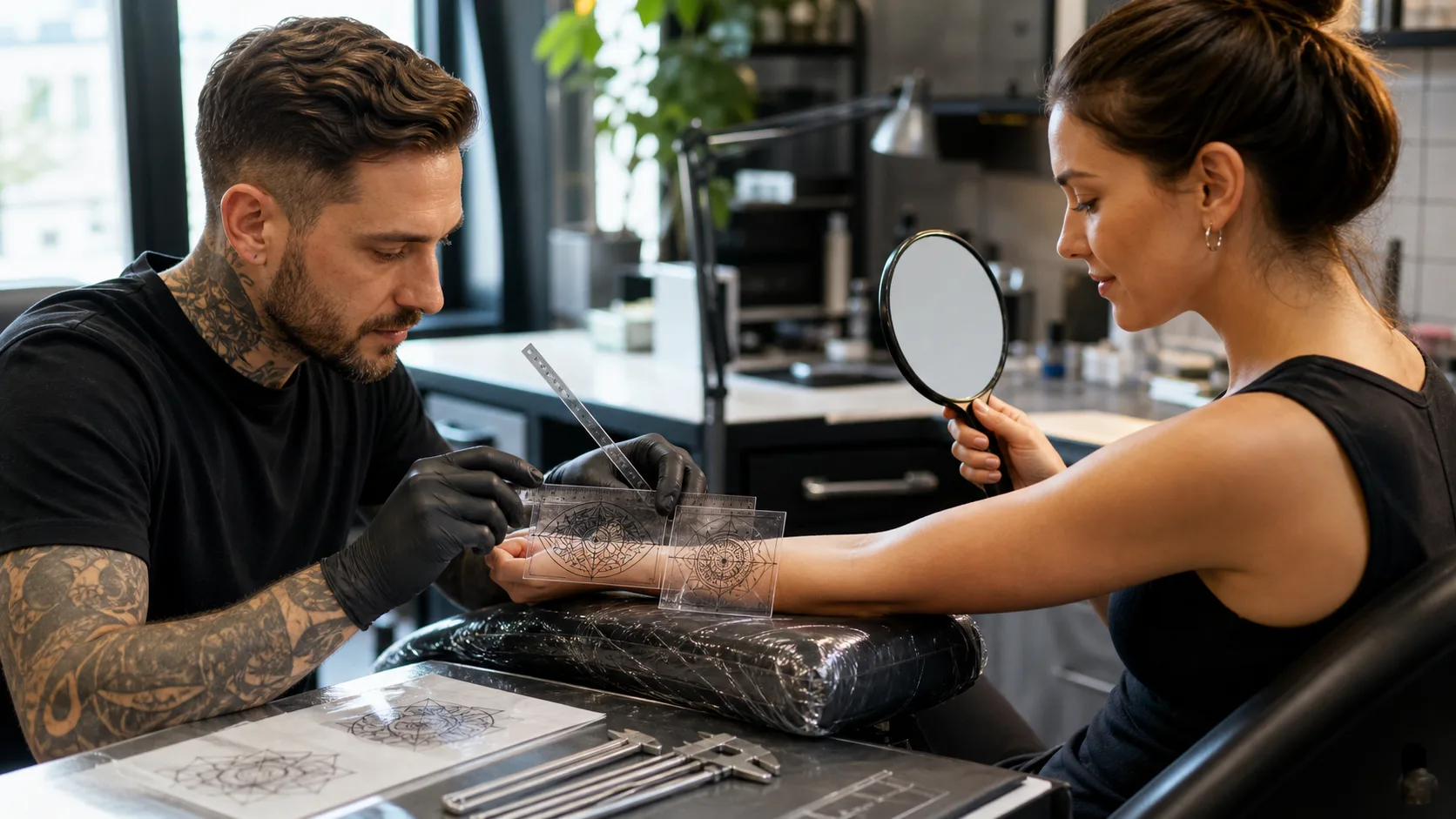
Custom stencils give us time to refine those details before the appointment. We can look closely at how each letter sits beside the next, adjust problem pairs, and make sure the overall tattoo fits your vision without giving up readability. Sometimes a small change in spacing makes a major difference in how the word is understood.
Placement Changes How Tattoo Lettering Reads
Skin is not a flat sheet of paper. It curves, stretches, folds, and moves, depending on where the tattoo is placed. A phrase that reads smoothly along a flat forearm may need a different layout for the ribs, shoulder, hand, foot, or another area that moves more often.
For multi-line tattoo lettering, space between lines matters just as much as space between letters. Lines that are stacked too closely can begin to compete with one another. This is especially noticeable in small designs, fine-line work, and placements where the skin bends often.
Before settling on a layout, we recommend thinking about a few practical questions:
- Should the tattoo be easiest for you to read, for others to read, or both?
- Will the placement curve around part of the body?
- Does the phrase need to be read as one line or several?
- Is the font still clear when viewed from a normal distance?
Orientation changes the experience of the tattoo, too. A wrist tattoo facing you may be easy for you to read, while a design facing outward may be easier for other people to see. Neither option is wrong. The best choice depends on the purpose of the piece, the placement, and how the lettering fits the body.
Plan for Aging and Winter Skin Care
Tattoos naturally soften as ink settles beneath the skin over time. That does not mean lettering tattoos cannot age well. It means spacing should be part of the design from the beginning. When letters and lines have enough breathing room, they have a better chance of staying separate as their edges gradually become less sharp.
Very small text and fine-line lettering call for honest expectations. In some cases, we may recommend a slightly larger size, a simpler font, or more spacing between letters. Those choices are not about changing the meaning of your tattoo. They are about protecting the message so it remains recognizable years from now.
Cool autumn and winter weather in Western New York can also leave skin feeling dry. Once a tattoo is fully healed, appropriate moisturizing can help keep the skin looking cared for. Following your artist’s aftercare instructions and protecting healed tattoos from sun exposure throughout the year can also help lettering look its best.
Choose Spacing That Honors Your Message
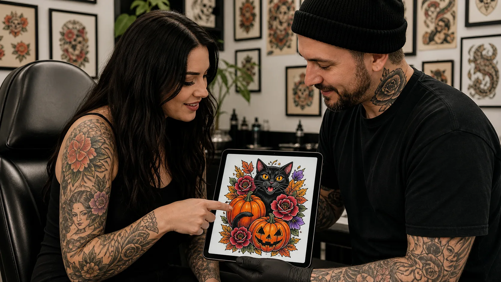
A meaningful phrase deserves more than a font chosen at random. During a consultation, it helps to ask about font options, sizing, placement, letter spacing, line spacing, and how the design may change over time. Bringing the exact wording you want is useful, but staying open to layout adjustments can protect the clarity of the final tattoo.
The best tattoo lettering balances feeling with function. Give every letter enough room to be itself, and your message can remain intentional, readable, and uniquely personal.
Make Every Word Clear And Lasting
At Lucky Deville Tattoo Co, we help turn meaningful words into designs that stay easy to read over time. Choose tattoo lettering with thoughtful placement, spacing, and a style that fits your message. Let’s create a piece that feels personal from the first look to every look after.